


Presafe
Refined MVP by streamlining caregiver onboarding to help monitor loved ones.
Team
1 Copywriter
1 UX Researcher
1 Project Manager
1 Engineer
Contribution
User research
Wireframes
Prototyping
UI Design
Timeline
4 months
Results
Improved workflow completion rates by 38%.
Reduced onboarding drop-offs, increasing user retention.
Achieved zero navigation errors during usability testing.
Results
Improved workflow completion rates by 38%.
Reduced onboarding drop-offs, increasing user retention.
Achieved zero navigation errors during usability testing.

Business Context
Presafe is a healthcare platform supporting 6.5M+ Americans with dementia and their caregivers. While aiming to enhance safety and independence, usability challenges hindered its effectiveness:
High Drop-Off Rates
Onboarding was too complex, causing users to abandon the app.
Navigation Inefficiency
All users had trouble completing tasks, leading to frustration.
Underutilized Features
Critical safety tools were overlooked due to navigation.
Accessibility Gaps
Elderly users needed help entering data due to usability limitations.
Accessibility Gaps
Elderly users needed help entering data due to usability limitations.
Underutilized Features
Critical safety tools were overlooked due to navigation.
Navigation Inefficiency
All users had trouble completing tasks, leading to frustration.


High Drop-Off Rates
Onboarding was too complex, causing users to abandon the app.
Presafe is a healthcare platform supporting 6.5M+ Americans with dementia and their caregivers. While aiming to enhance safety and independence, usability challenges hindered its effectiveness:
Business Context

Quotes from our user testing
Discovery Process
To understand user pain points and improve the experience, I conducted comprehensive research:
To understand user pain points and improve the experience, I conducted:
User Interviews
Engaged with 11 participants uncovering challenges in task management and navigating the app.
Usability Testing
Observed real-time interactions and identify key pain points in the user experience.
Survey Analysis
Analyzed responses highlighting underutilized features like real-time alerts and location tracking.
Heuristic Evaluation
Identified inconsistencies in navigation and areas for improvement in Neilson's score.
Key Insight
60% of caregivers reported frustration with unclear onboarding steps.
Key Insight
60% of caregivers reported frustration with unclear onboarding steps.
Key Insight
60% of caregivers reported frustration with unclear onboarding steps.
Key Insight
60% of caregivers reported frustration with unclear onboarding steps.
Caregiver
Needs efficient tools for monitoring and managing tasks, prioritizing security and ease of use.
Care Recipient
Needs simplicity, independence, and easy navigation with larger,
clearer controls.
Caregiver
Needs efficient tools for monitoring and managing tasks, prioritizing security and ease of use.
Care Recipient
Needs simplicity, independence, and easy navigation with larger, clearer controls.
Quotes from our user testing

Problem 1 - Onboarding
Complex onboarding with excessive personal questions caused caregiver frustration and dropoffs.
Solution
Split onboarding into separate caregiver and recipient flows, reducing friction and improving completion rates.
Problem 1 - Onboarding
Complex onboarding with excessive personal questions caused caregiver frustration and dropoffs.
Solution
Split onboarding into separate caregiver and recipient flows, reducing friction and improving completion rates.
Problem 1 - Onboarding
Complex onboarding with excessive personal questions caused caregiver frustration and dropoffs.
Solution
Split onboarding into separate caregiver and recipient flows, reducing friction and improving completion rates.
Before

Before/After of onboarding flow for caregivers
After

Before/After of onboarding flow for caregivers
Result
Cut onboarding from 20 to 3 screens
Made notifications and contacts setup optional
Simplified safe zone configuration
Result
Cut onboarding from 20 to 3 screens
Made notifications and contacts setup optional
Simplified safe zone configuration
Problem 1 - Onboarding
Complex onboarding with excessive personal questions caused caregiver frustration and dropoffs.
Solution
Split onboarding into separate caregiver and recipient flows, reducing friction and improving completion rates.
Before
Before/After of onboarding flow for caregivers
After
Before/After of onboarding flow for caregivers
Result
Cut onboarding from 20 to 3 screens
Made notifications and contacts setup optional
Simplified safe zone configuration
Result
Cut onboarding from 20 to 3 screens
Made notifications and contacts setup optional
Simplified safe zone configuration
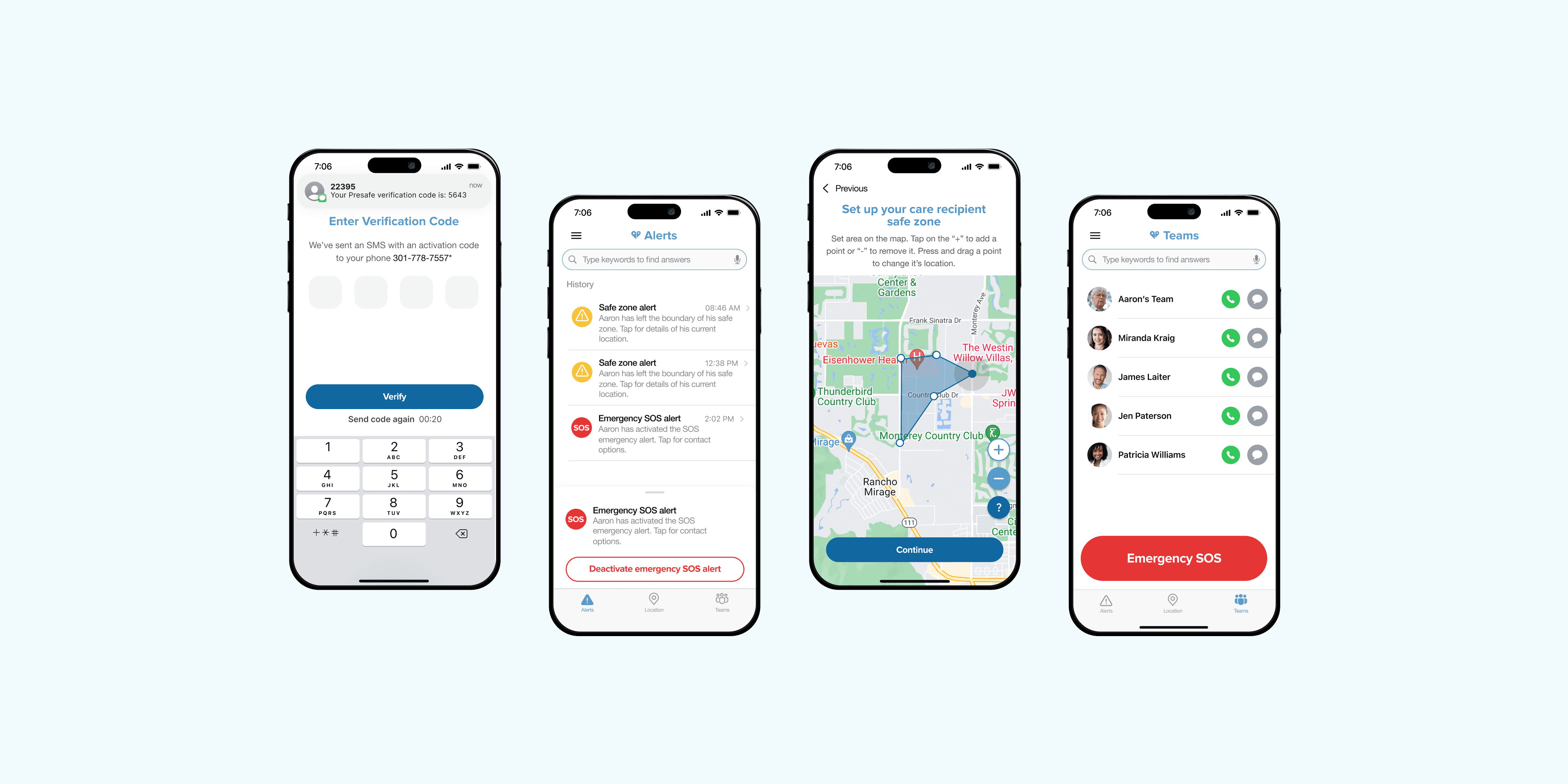
Problem 2 - Navigation
Complex icons and unclear labels made navigation confusing and led to poor usability.
Solution
Simplified the app’s navigation by introducing clearer icons and more user-friendly language.
Problem 2 - Navigation
Complex icons and unclear labels made navigation confusing and led to poor usability.
Solution
Simplified the app’s navigation by introducing clearer icons and more user-friendly language.
Problem 2 - Navigation
Complex icons and unclear labels made navigation confusing and led to poor usability.
Solution
Simplified the app’s navigation by introducing clearer icons and more user-friendly language.
Before


After
Alerts
Location
Teams
Simplified navigation: Alert types (‘Triage’) consolidated under Alerts page for clarity, while Teams moved from side menu to tab bar for easier access.

Alerts

Location

Teams
Before
After
Simplified navigation: Alert types (‘Triage’) consolidated under Alerts page for clarity, while Teams moved from side menu to tab bar for easier access.
Problem 2 - Navigation
Complex icons and unclear labels made navigation confusing and led to poor usability.
Solution
Simplified the app’s navigation by introducing clearer icons and more user-friendly language.
Before
After
Alerts
Location
Teams
Simplified navigation: Alert types (‘Triage’) consolidated under Alerts page for clarity, while Teams moved from side menu to tab bar for easier access.
Alerts
Location
Teams
Before
After
Simplified navigation: Alert types (‘Triage’) consolidated under Alerts page for clarity, while Teams moved from side menu to tab bar for easier access.
Problem 3 - Safe Zone
The Safe Zone feature was hidden in the profile drawer, making it hard to discover.
Solution
Moved Safe Zone to location tab for easier access. Added custom map-drawing tools to create flexible, resizable zones.
Problem 3 - Safe Zone
The Safe Zone feature was hidden in the profile drawer, making it hard to discover.
Solution
Moved Safe Zone to location tab for easier access. Added custom map-drawing tools to create flexible, resizable zones.
Problem 3 - Safe Zone
The Safe Zone feature was hidden in the profile drawer, making it hard to discover.
Solution
Moved Safe Zone to location tab for easier access. Added custom map-drawing tools to create flexible, resizable zones.
Problem 3 - Safe Zone
The Safe Zone feature was hidden in the profile drawer, making it hard to discover.
Solution
Moved Safe Zone to location tab for easier access. Added custom map-drawing tools to create flexible, resizable zones.
Set up a safe zone during onboarding effortlessly
Set up a safe zone during onboarding effortlessly
Problem 4 - Accessibility
Small buttons and lack of screen reader support made the app hard for elderly users to navigate.
Solution
Designed a tailored version for elderly users, featuring larger CTAs, higher contrast, and screen reader support.
Problem 4 - Accessibility
Small buttons and lack of screen reader support made the app hard for elderly users to navigate.
Solution
Designed a tailored version for elderly users, featuring larger CTAs, higher contrast, and screen reader support.
Problem 4 - Accessibility
Small buttons and lack of screen reader support made the app hard for elderly users to navigate.
Solution
Designed a tailored version for elderly users, featuring larger CTAs, higher contrast, and screen reader support.
Problem 4 - Accessibility
Small buttons and lack of screen reader support made the app hard for elderly users to navigate.
Solution
Designed a tailored version for elderly users, featuring larger CTAs, higher contrast, and screen reader support.
Problem 5 - Message Tab
The messaging feature was buried in a standalone tab, leading to UI clutter and increased development complexity.
Solution
Offloaded messaging functionality to other features, simplifying the UI.
Problem 5 - Message Tab
The messaging feature was buried in a standalone tab, leading to UI clutter and increased development complexity.
Solution
Offloaded messaging functionality to other features, simplifying the UI.
Problem 5 - Message Tab
The messaging feature was buried in a standalone tab, leading to UI clutter and increased development complexity.
Solution
Offloaded messaging functionality to other features, simplifying the UI.
Before

Original to final design evolution, validated by user feedback.
After

Original to final design evolution, validated by user feedback.
Problem 5 - Message Tab
The messaging feature was buried in a standalone tab, leading to UI clutter and increased development complexity.
Solution
Offloaded messaging functionality to other features, simplifying the UI.
Before
Original to final design evolution, validated by user feedback.
After
Original to final design evolution, validated by user feedback.

Conclusion
Through user feedback and iteration, Presafe's redesign simplified the experience while improving accessibility and engagement. These changes empowered both caregivers and care recipients, helping them maintain independence and safety.
Conclusion
Through user feedback and iteration, Presafe's redesign simplified the experience while improving accessibility and engagement. These changes empowered both caregivers and care recipients, helping them maintain independence and safety.
Next Steps
We aim to further enhance the platform with:
Guided tooltips for streamlined onboarding.
Customizable reminders for caregivers.
Apple Watch integration for continuous health monitoring.
Next Steps
We aim to further enhance the platform with:
Guided tooltips for streamlined onboarding.
Customizable reminders for caregivers.
Apple Watch integration for continuous health monitoring.
© 2025 Designed & built in New York
© 2025 Designed & built in New York
© 2025 Designed & built in New York
© 2025 Designed & built in New York